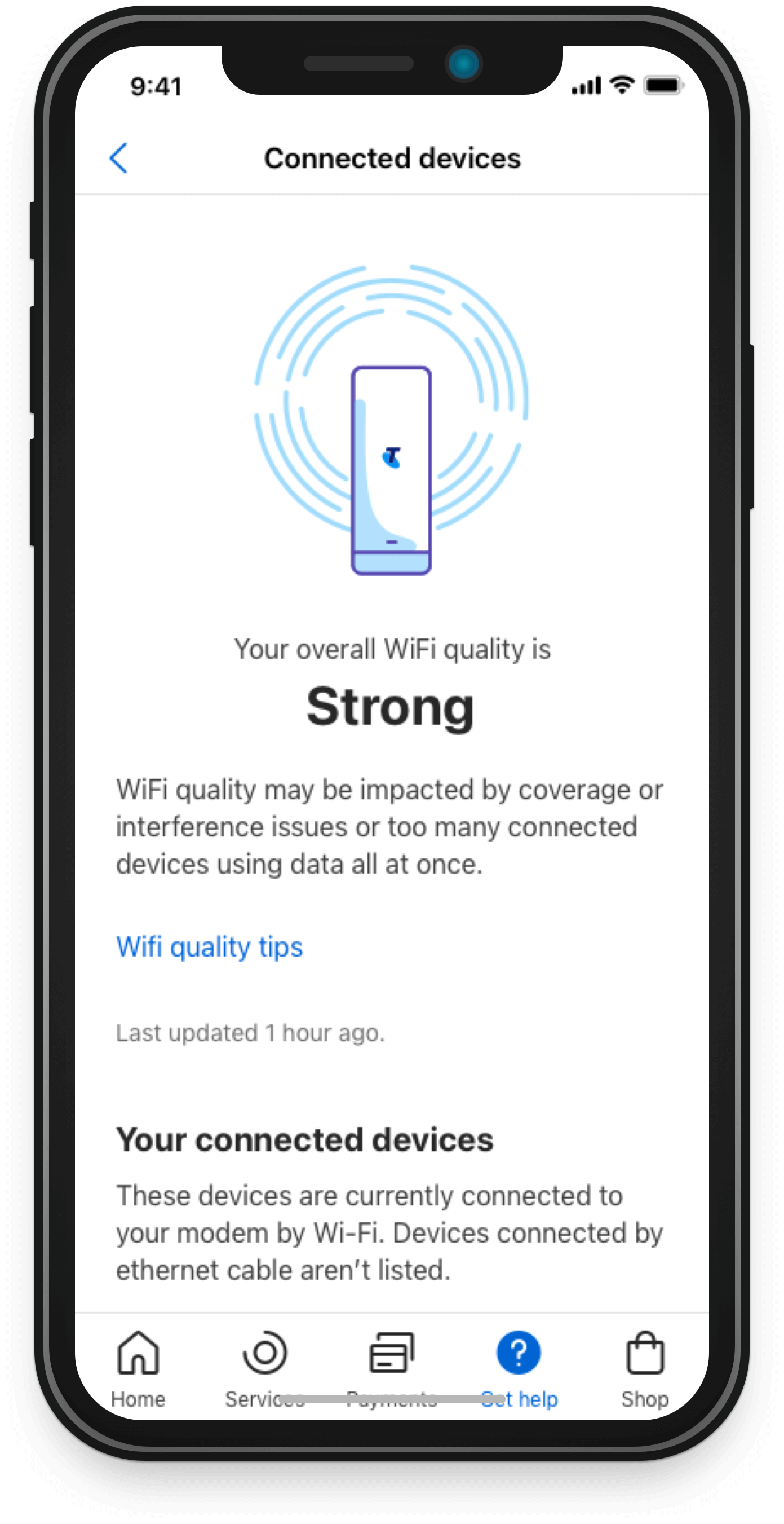
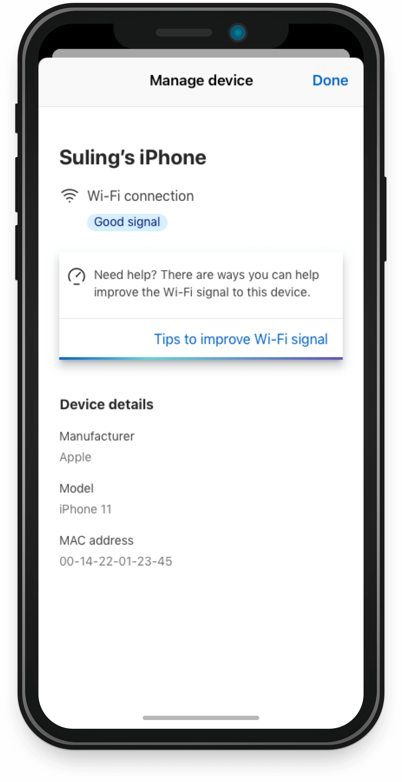
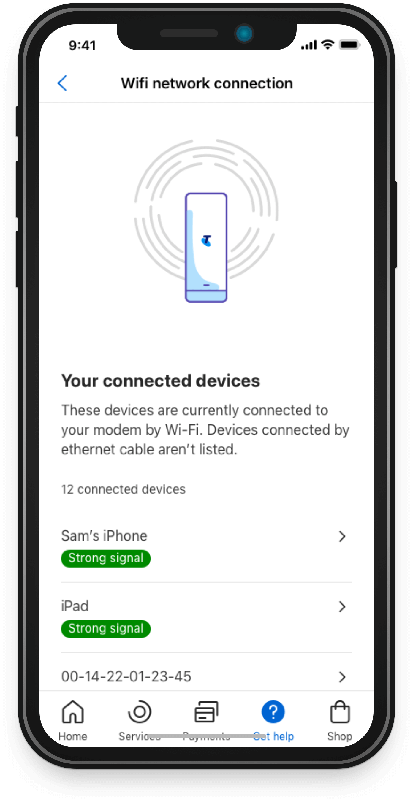
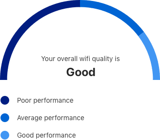
Overview
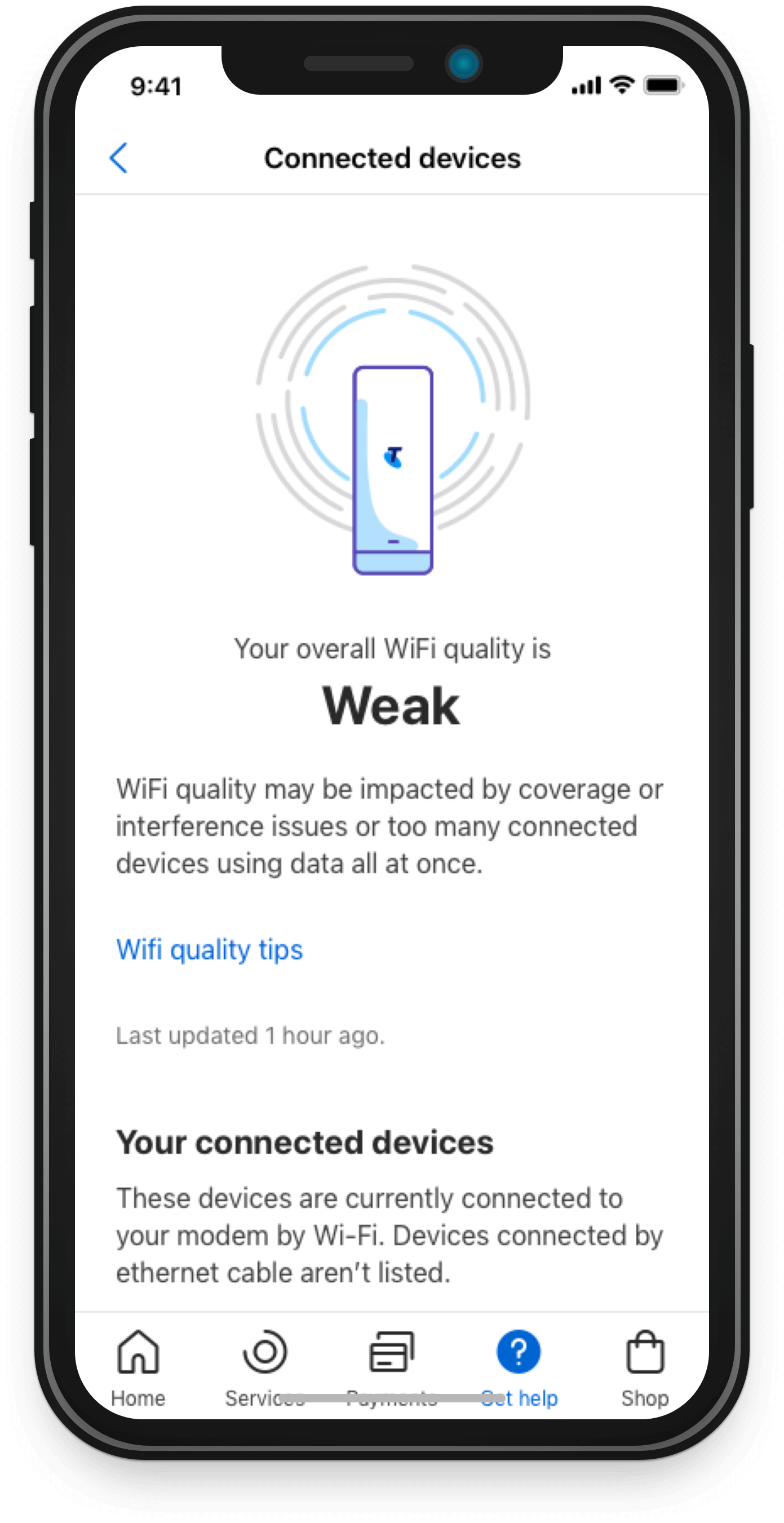
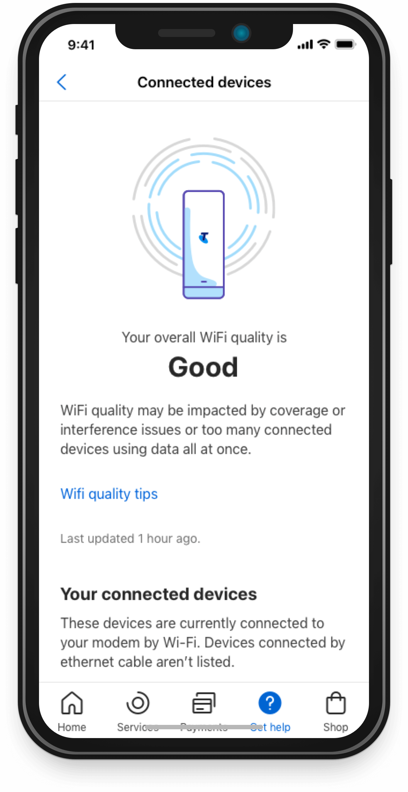
WiFi Quality allows customers a better and more transparent view on how their service is performing as well as the ability to understand and resolve their WiFi issues. For the purpose of this portfolio, I will be focusing heavily on the accessibility considerations that were undertaken.
Role: Visual Design Lead
Platform: Mobile (iOS and Android)
Designed Using: Sketch and Adobe Illustrator
Featured on the CEO of Telstra's LinkedIn


Brief
From a Visual Design perspective, the ask was to visualize and communicate the WiFi Quality outcome.
While this initially seemed like a relatively simple brief, there were several challenges that emerged from managing stakeholder requirements and expectations.
In terms of requirements, the ask had changed multiple times and our team was faced with strict timelines for the “Explore” and “Create” phase, limiting the ability to conduct user testing and ensure the proper accessibility standards were met.
Process
From a VD point of view, there was quite a fair bit of accessibility consideration that went into the final visualisation. And a large part of this was due to the initial requirements that were provided to us by our stakeholders. This being having the
speed dial with the red/yellow/green.

Iteration 1
Whilst this approach was quite intuitive as the traffic light symbolism is considered universal, the combination of these colours does not meet our AA accessibility standards whereby people who are red-green colourblind wouldn’t be able to see the visualisation. Not only that, but this really doesn’t align with our MyTelstra Branding and design system.

Iteration 2
I did attempt to Telstra-fy this, but it still doesn’t work due the low-contrast ratio. And because this falls under a graphical representation, we needed to have the legend down below. This then created the issue where it looks so complex for something that is so simple which isn’t ideal at all.
Final UX Flow and Visual Designs
These accessibility concerns led me to question whether the speed dial visualisation was still the right approach. From a UX and user-friend perspective, the emphasis should be on communicating what the outcome of the WiFi Quality test is, rather than hijacking that attention onto the visualisation.
From undertaking this process, this became the final Visual Design. As the page is calling the API, the circles are spinning, and this typically takes about 3 seconds. A “Weak” signal, which is indicated by only a singular circle being highlighted in blue. A “Good” signal, which is indicated by 2 circles being highlighted. And a “Strong” signal, with all 4 circles being highlighted.


Results
1
Accessibility compliance
With the traffic light approach, it provided itself with an unnecessary sense of urgency and priority.
In utilising a simple illustration, it shifts the visualisation into more of a decorative element, rather than functional. Decorative in the sense that, it is now a delightful loading animation as opposed to being the main source of communicating the WiFi Quality outcome; addressing the initial accessibility concerns.
2
Enhances communication of the outcome
In making this decision, it allows the outcome to be much more clearly presented and easy to understand, rather than it being overshadowed by the visuals.
In doing so, it meets both the project and end-user goals of allowing customers to have better visibility and awareness of their WiFi quality. This creates a great foundation for MVP4 when tips and solutions will be provided to alleviate any identified issues.