Overview
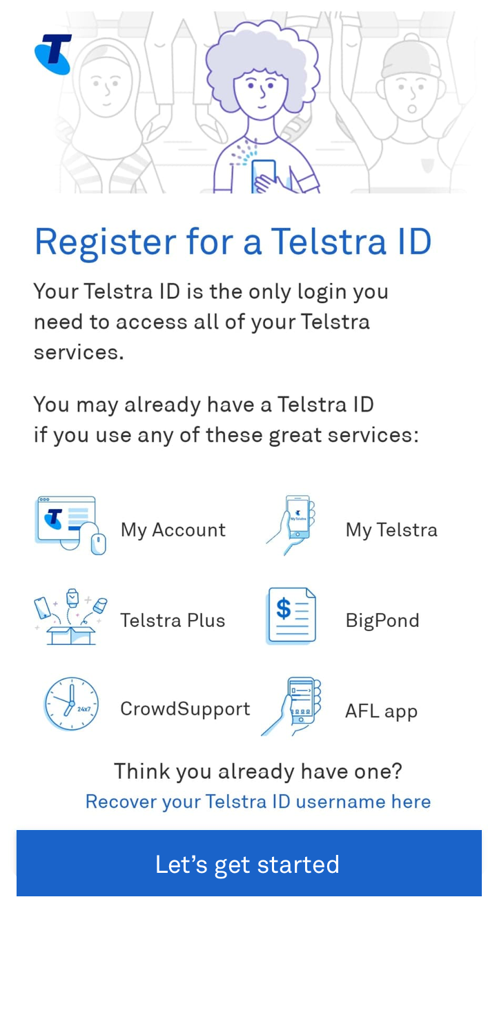
The Telstra Registration journey has been a known painpoint to both Telstra and customers alike. This project investigates the root causes of unsuccessful registrations and uplifts the existing flow to comply with Telstra's new design system and meet Level AA Accessibility standards.
To view the live journey, register for a Telstra ID today here.
Role: Visual Design Lead and Co-UX Design Researcher
Platform: Web (desktop and mobile)
Designed Using: Sketch
Winner of the 2021 Q3 Telstra DaVey Awards
.png)
.png)
Problem
For our customers to login to MyTelstra and have access to their Telstra services, they need to navigate and successfully complete the registration journey.
At the beginning of this project, only approximately 28% of users that initiated the registration flow were able to complete the journey.
Through conducting an audit of our internal systems and usability testing with our customers, we identified 3 root causes.
Through utilising data from Adobe Analytics, the first 4 screens of the journey were the most problematic and required immediate attention. Within the month of October 2020, we captured the following unique visitors and bounce rates for each screen:

Unique visitors: 150,595
Bounce rates: 27.39%
.png)
Unique visitors: 116,398
Bounce rates: 9.99%
.png)
Unique visitors: 68,276
Bounce rates: 13.09%
.png)
Unique visitors: 26,184
Bounce rates: 31.33%
Users typically exited the journey as they continually saw one of the following error screens.
.png)
Error 1
.png)
Error 2
.png)
Error 3
This was an incredibly important journey to re-engineer and uplift as it directly impacted the number of people registering for a Telstra ID which subsequently hinders their ability to receive the full benefits of the MyTelstra experience.
Solution
As a result of the user testing findings, there were 3 clear courses of action:
1. Redesign the splash screen
2. Unhide any hidden instructions
2. Provide clearer directions and instructions
.png)
1. Redesign the splash screen
As mentioned previously, one of the main findings was that the customer was unaware of any information they needed to have ready on hand and thus exited the journey.
To address this, changes to the copy content on the splash screens were made. Previously, the copy was focused entirely on the benefits of registering for a Telstra ID. This has now been removed and explicitly communicates the purpose of this flow as well as what is needed in order for the user to successfully complete the journey.
If the user does not have these items ready on hand, it allows them to come back at a later time. Whilst this will increase the bounce rate on this screen, it allows the user to fail early and fallout rather than be inconvenienced and frustrated during the latter stages of the journey.
2. Unhide hidden instructions
As per the second insight derived from our user testing: participants were finding it difficult to complete the flow due to the lack of instructions. In some instances, these instructions were hidden behind a circled question mark symbol. This was most prevalent in the "Create my Telstra ID" page where the password requirements were hidden. Customers who were more digitally challenged were incredibly confused as to why their created password was not being accepted.
As such, all question mark symbols were removed and all instructions are permanently displayed.
.png)
.png)
3. Provide clearer direction and instruction
The difficulty in completing the flow due to the lack of direction was particularly relevant on the "Enter account details" as this was the page in which our users struggled the most with. Here, it was vital that users inputted their given and family name exactly as their ID they used when they first bought a plan with Telstra.
While this seems obvious, we recorded thousands of unsuccessful attempts caused by customers not including any special characters such as apostrophes and hyphens as per their ID.
The help text aids users through providing more direction of what to include in their input, and in some instances, directs them to places they can find that information (i.e. "This is the account number found on your bill".)
Final UX Flow and Visual Designs
In addition to incorporating the insights gathered during user testing, the Visual Designs have also been uplifted with Telstra's new branding guidelines which meets WCAG 2.1 (AA) accessibility standards.
.png)
.png)
.png)
.png)
Results
Since launch in March 2021 we have seen...
average daily successful registrations (vs average daily success over 90 days pre-uplift)
unique visitors seeing an error caused by not having any contact details (email/phone) saved against the users contact record.
users re-entering details and seeing an error to retry
unique visitors seeing an error when they reach the maximum number of registration attempts